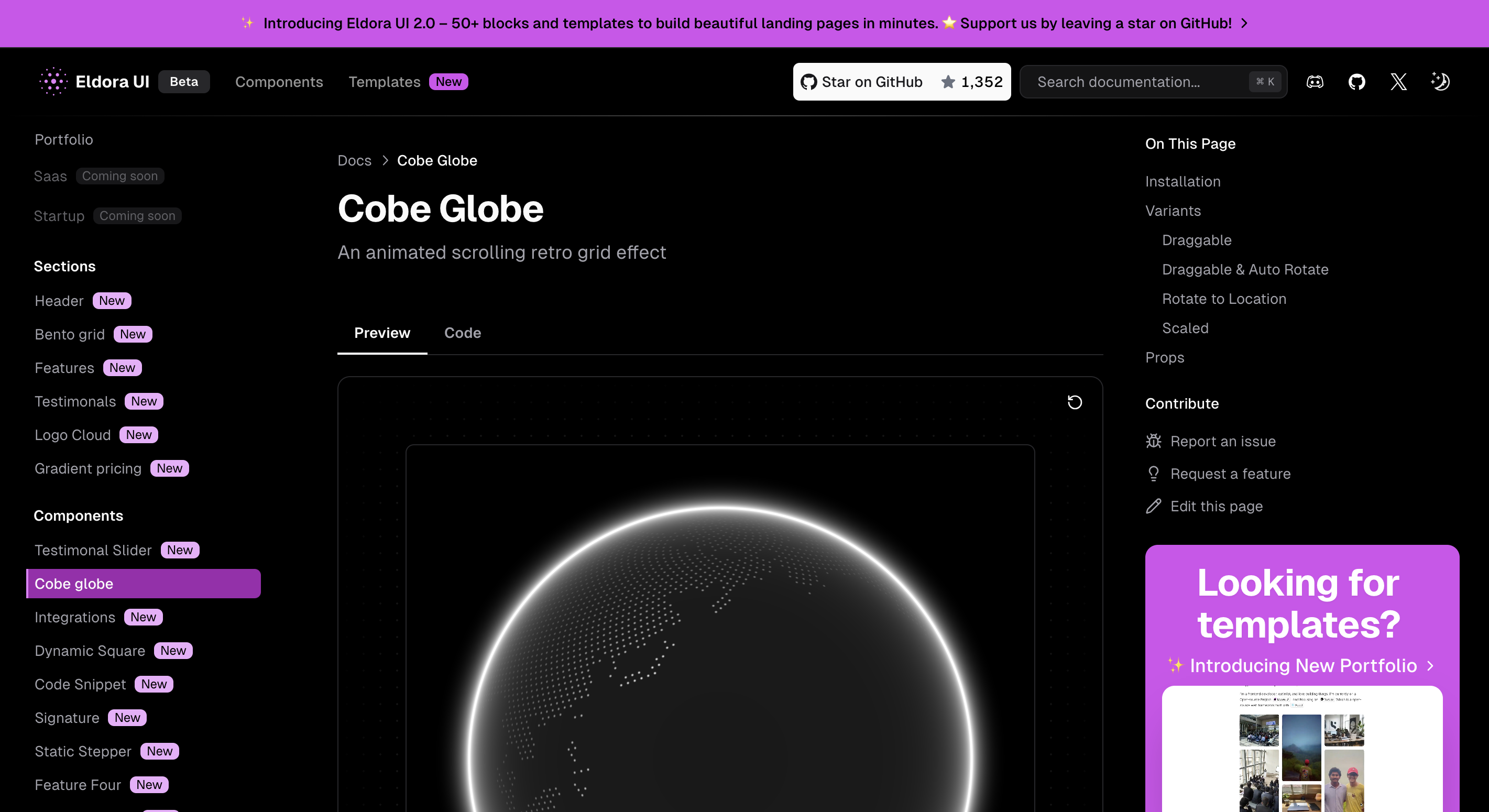
How does it work ?
How to use the Easiest component librairy : EldoraUI
Installation
Copy and paste the following code into your project.
components/eldoraui/featurefour.tsx
"use client";
import { useEffect, useState } from "react";
import { cn } from "@/lib/utils";

//TODO : Improve mobile version to display the image down the corresponding text instead of at the full bottom

export function TextComponent({
  number,
  title,
  content,
  isOpen,
  loadingWidthPercent,
}: Readonly<{
  number: number;
  title: string;
  content: string;
  isOpen: boolean;
  loadingWidthPercent?: number;
}>) {
  return (
    <div
      className={cn(
        "transform-gpu rounded-lg border transition-all",
        isOpen
          ? "border-neutral-500/10 bg-gradient-to-b from-neutral-200/15 to-neutral-200/5 dark:border-neutral-500/15 dark:from-neutral-600/15 dark:to-neutral-600/5 dark:shadow-[2px_4px_25px_0px_rgba(248,248,248,0.06)_inset] "
          : "scale-90 border-transparent opacity-50 saturate-0",
      )}
    >
      <div className="flex w-full items-center gap-4 p-4">
        <p
          className={cn(
            "inline-flex size-8 shrink-0 items-center justify-center rounded-md bg-neutral-500/20 text-neutral-600",
          )}
        >
          {number}
        </p>
        <h2
          className={cn(
            "text-left text-xl font-medium text-neutral-800 dark:text-neutral-200",
          )}
        >
          {title}
        </h2>
      </div>
      <div
        className={cn(
          "w-full transform-gpu overflow-hidden text-left text-neutral-600 transition-all duration-500 dark:text-neutral-400",
          isOpen ? " max-h-64" : "max-h-0",
        )}
      >
        <p className="p-4 text-lg">{content}</p>
        <div className="w-full px-4 pb-4">
          <div className="relative h-1 w-full overflow-hidden rounded-full">
            <div
              className={cn("absolute left-0 top-0 h-1 bg-neutral-500")}
              style={{ width: `${loadingWidthPercent}%` }}
            />
          </div>
        </div>
      </div>
    </div>
  );
}Update the import paths to match your project setup.
Props
TextComponent Component Props
| Prop Name | Type | Default | Description |
|---|---|---|---|
number | number | - | The number to display, typically used for ordering or numbering items. |
title | string | - | The title or label associated with the text content. |
content | string | - | The content text to display. |
isOpen | boolean | - | A boolean indicating whether the content is expanded (true) or collapsed (false). |
loadingWidthPercent | number | 0 | The width percentage of the loading progress bar, typically between 0 and 100. (Optional) |